This project’s goal is to manage and create open Now Components.
Contributing
Hi there! We’re thrilled that you’d like to contribute to Now Component Catalog. Your help is essential for keeping it great.
The Now Component Catalog is an open source project supported by the efforts of an entire community and built one contribution at a time by users like you. We’d love for you to get involved. Whatever your level of skill or however much time you can give, your contribution is greatly appreciated. There are many ways to contribute, from submitting bug reports and feature requests, helping other users by commenting on issues, or writing code which can be incorporated into site itself or adding new components to the catalog.
Following these guidelines helps to communicate that you respect the time of the developers managing and developing this open source project. In return, they should reciprocate that respect in addressing your issue, assessing changes, and helping you finalize your pull requests.
As an individual
- Seeding Ideas for Now Components by raising Issues against this repository
- Fleshing out Ideas for Now Components by raising Issues against the component’s repository
- Updating this site to better show this catalog
- Creating Components and making pull request to add them here
- Share details about this on your social networks.
- Become part of the maintainers to accept Pull Requests, and run the project.
As a corporation
To get more people involved lets lure them with stuff, or help us lure them with stuff.
- Shipping swag to people
- Allowing person to order some swag at no cost and ship it
- Pay for shipping of existing swag
- Donate swag
- Share details about this on your social networks.
How
- Now Components need their own Scope in ServiceNow. You can only have one scope in a repository, as such, this repository will act as catalog of those other repositories.
- Because we want these components available for the foreseeable future, this organziation will have all the repositories.
- To get a repository in this organization, log an issue or comment on an issue that you want to build that specific component.
- Once a repository is made, fork it
- In your fork, follow the flow
- When it’s working properly, make a pull request to the original repo in this organization
- Make a fork of this repository and add details about the component.
- Include a screenshot of it, a description, and if relevant, a code snippet to call it.
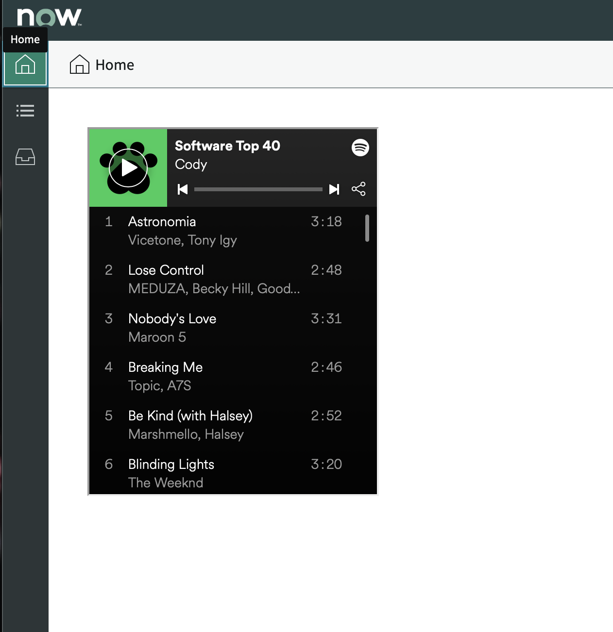
- You’ll likely just copy how the Spotify component is done is done
- You will be contacted by a maintainer to figure out swag.
Components
Code Block
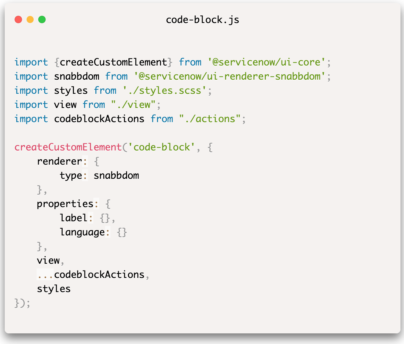
Made By Tomas HrobariktA code-block element that can be used for rendering code snippets inside of the HTML. It is using PrismJS for syntax highlighting. Other suggestions for improvement are welcomed 👋
<code-block language="javascript" label="demo.js">
import {createCustomElement} from '@servicenow/ui-core';
import snabbdom from '@servicenow/ui-renderer-snabbdom';
import styles from './styles.scss';
import view from "./view";
import codeblockActions from "./actions";

createCustomElement('code-block', {
renderer: {
type: snabbdom
},
properties: {
label: {},
language: {}
},
view,
...codeblockActions,
styles
});
</code-block>
Font Awesome Icons
Made By James FreundThe icon set has been loaded as a component named fa-icon and works similarly to how now-icon works. For example:
<fa-icon icon="check" size="lg" spin="true"></fa-icon>
The list of icons that can be used with this component can be found on https://nowcomponents.github.io/fa-icon/
Below is a screenshot of the demo component I created that uses fa-icon as a subcomponent.

KB Approval Card
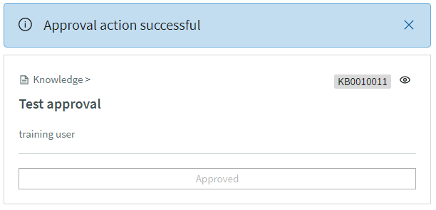
Made By NiaA KB Approval card component that takes in a sys_id of a KB Approval Record.
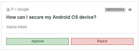
This is a simple KB Approval card component rendered a now-card component.
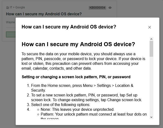
For Paris release version - leverages now-card, now-rich-text, and now-modal components
The KB article content is displayed in a now-modal pop-up when clicking on the action represented by the eye icon in the top right corner of the card.
To test, update the sysid attribute in the example - provide a valid sys_id of an Approval [sysapproval_approver] record in your instance.
When the approval is actioned, the component provides feedback with the status and updates the card.
My Requests
Made By Jaydeep DebNow Experience component to display current user’s requested items in a card view. The component updates itself in real-time so that users can see their requests getting processed.
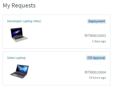
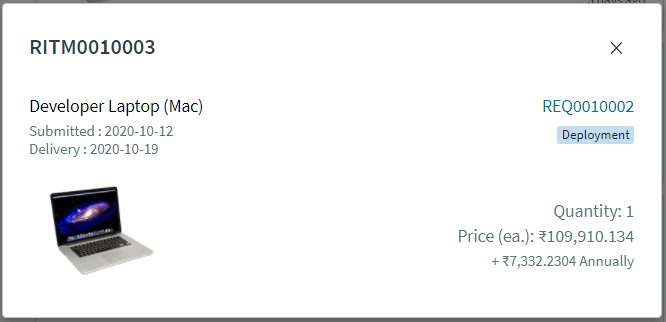
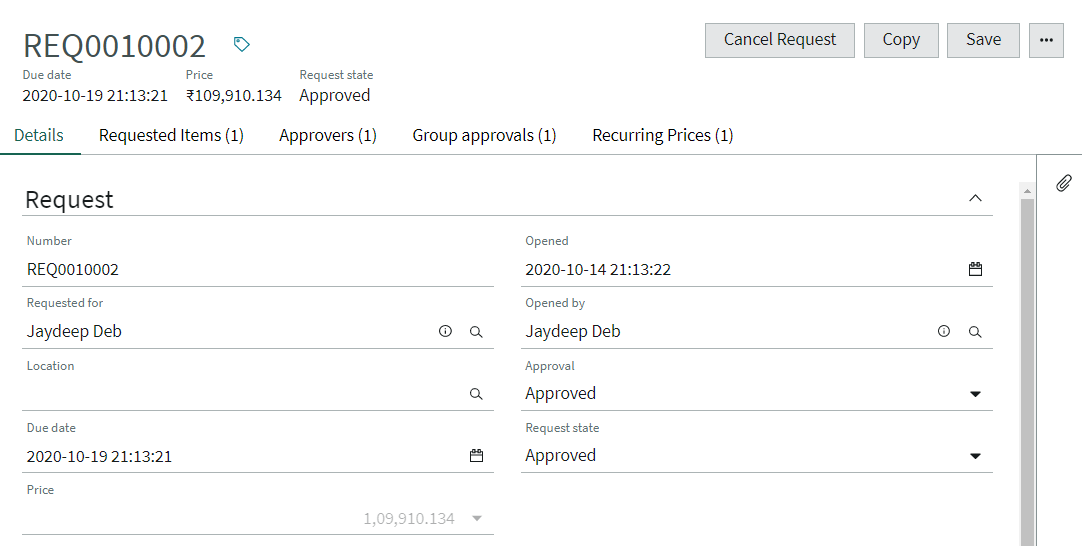
Each item displays the current stage & time ago since it was requested. Items can be viewed in detail in a modal view. Users can further drill down to the request record in Workspace from the modal view.
Useful utilties for fellow NowExperience developers :
-
UI GlideSystem [GlideSystem API over REST] - Update Set Requires {methodName} as path param & {args} in a query param (comma-separated)
-
RecordWatcher for NowExperience components [Uses ServiceNow’s Asynchronous Messaging Bus (amb) service]
Spotify
Made By PaigeEmbed a spotify playlist
Tag Field
Made By James FreundA field to manage tags

Todo
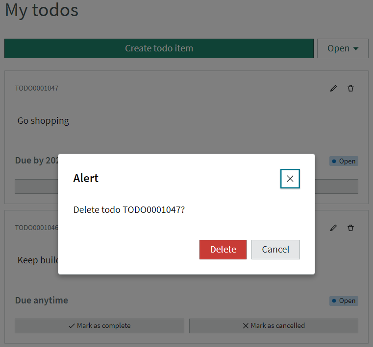
Made By Brad TiltonTodo component that works with the Simple Todo app.
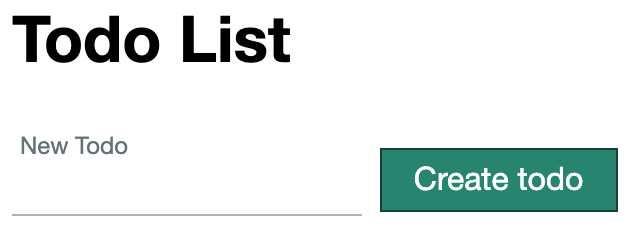
This is a simple todo list component that uses multiple subcomponents to build a pretty todo list. NowExperience components used are httpEffect, now-alert, now-button, now-card, now-dropdown, now-heading, now-highlighted-value, now-input, now-loader, now-modal,now-textarea.
You can create new, complete, and cancel todos from the component. You can also edit & delete existing todos. Also, you can cycle between todos in different states using the dropdown (Open/Complete/Cancelled)
The component works with a simple todo list app found here: github.com/bradtiltonnow/simple-todo.
Please check the issues for enhancement ideas or add some of your own.
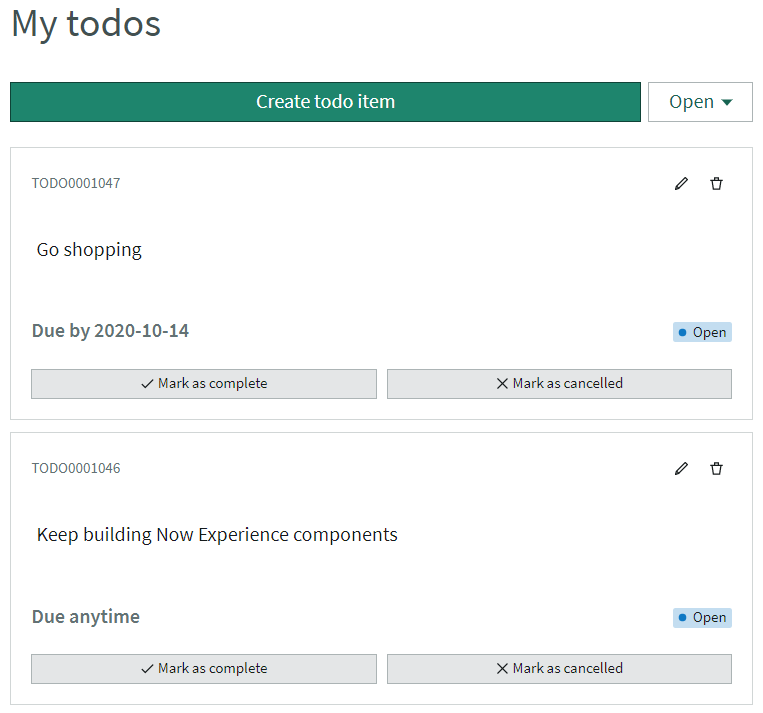
Subcomponent details can be found below:
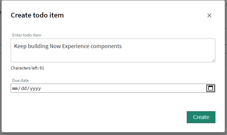
1. new-todo-item component
- Component which opens in now-modal & allows creating new todos
- Users can input todo content(textarea) & due date(datepicker)
2. todo-item component
- Created card layout to display each todo Issue#2
- Displays todo number, content, due date & state
- Todos can be Completed/Cancelled using the footer buttons
- Due date can be found in the bottom of the card (Due by “date”/Due anytime) Issue#4
- Todos can be edited (content & due date) Issue#3
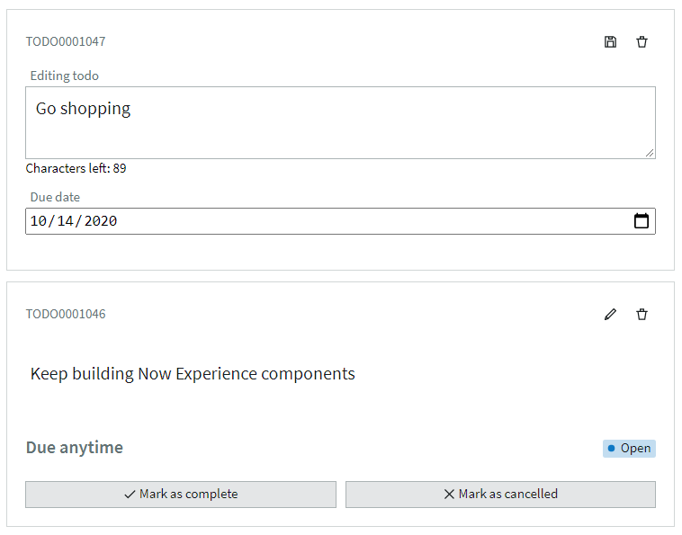
- Todos can be deleted (displays popup)
